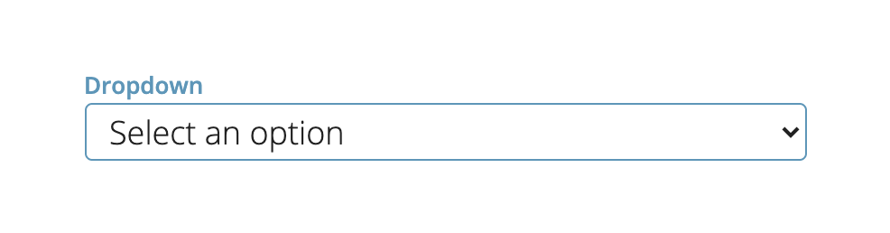
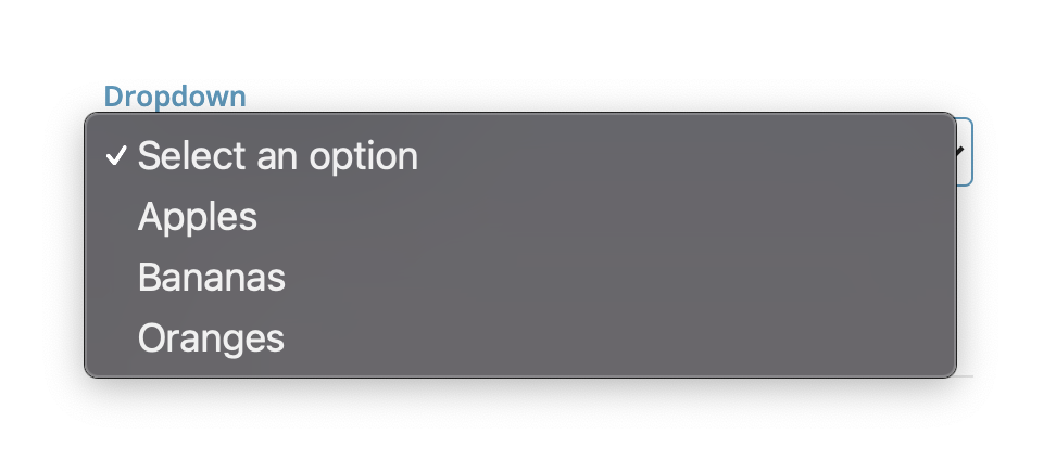
Dropdown
Dropdowns are best for selecting choices from a known list
Configuration | Value |
|---|---|
Required | Toggle on/off if required |
Select Multiple | Toggle on/off if multiple choices can be selected |
Label | Enter a label for your dropdown input |
Choices | Enter the choices for your dropdown input separated by a comma.
|
Choice Labels | Optional Input. If left blank, this will show the options in Choices.
|
Theme-able Classes
.themeable_input_dropdown_container {
  /* styling of the root element containing the input and the label */
}

.themeable_input_dropdown_label {
  /* styling of the label */
}

.themeable_input_dropdown_box {
  /* styling of the box containing the select element and the arrow (if not autocomplete) */
}

.themeable_input_dropdown_arrow {
  /* styling of the dropdown arrow (if not autocomplete) */
}

.themeable_input_dropdown {
  /* styling of the select element (if not autocomplete) */
}
Updated 5 months ago