Date
Request a calendar date
Looking to have a user enter in a date? The date input accepts dates formatted in MM/DD/YYYY.
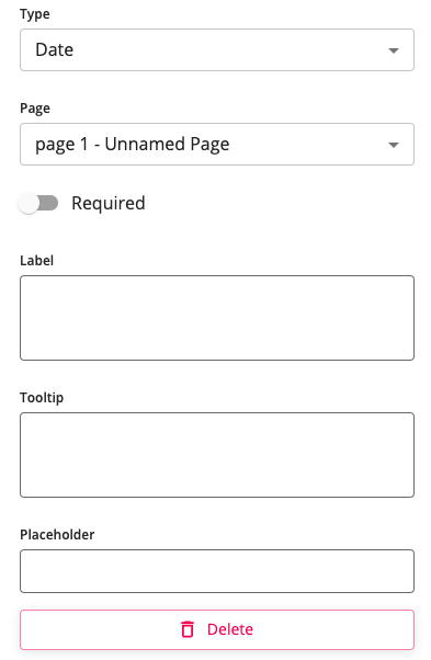
Below is a table that breaks down each part of the date modal
Configuration | Value |
|---|---|
Required | Toggle on/off if required |
Label | Describes the purpose of the input to the user. Labels remain visible even after completing the field |
Tooltip | A short description that appears when the user holds the mouse pointer briefly over the question mark without clicking |
Placeholder | Placeholder that shows in text box before date input |

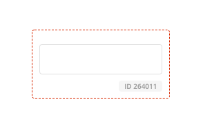
Date Input SizeWhen adjusting the date inside your form, the minimal dimensions are 2 x 3 (W x H).
If the dimensions are too small, you will see the dotted perimeter turn red. We recommend adjusting the dimensions to prevent and visual issues to your users.

Theme-able Classes
.themeable_input_generic_container {
  // styling of the generic root containing the label and the input
}

.themeable_input_date_container {
  // styling of the input date specific root containing the label and the input
}

.themeable_input_generic_label {
  // styling of the generic label
}

.themeable_input_date_label {
  // styling of the input date specific label
}

.themeable_input_generic {
  // styling of the generic input (textbox)
}

.themeable_input_date {
  // styling of the input date specific input (textbox)
}

.themeable_input_generic_error {
  // styling of the generic error message
}

.themeable_input_date_error {
  // styling of the input date specific error message
}
Updated 4 months ago
