Modal
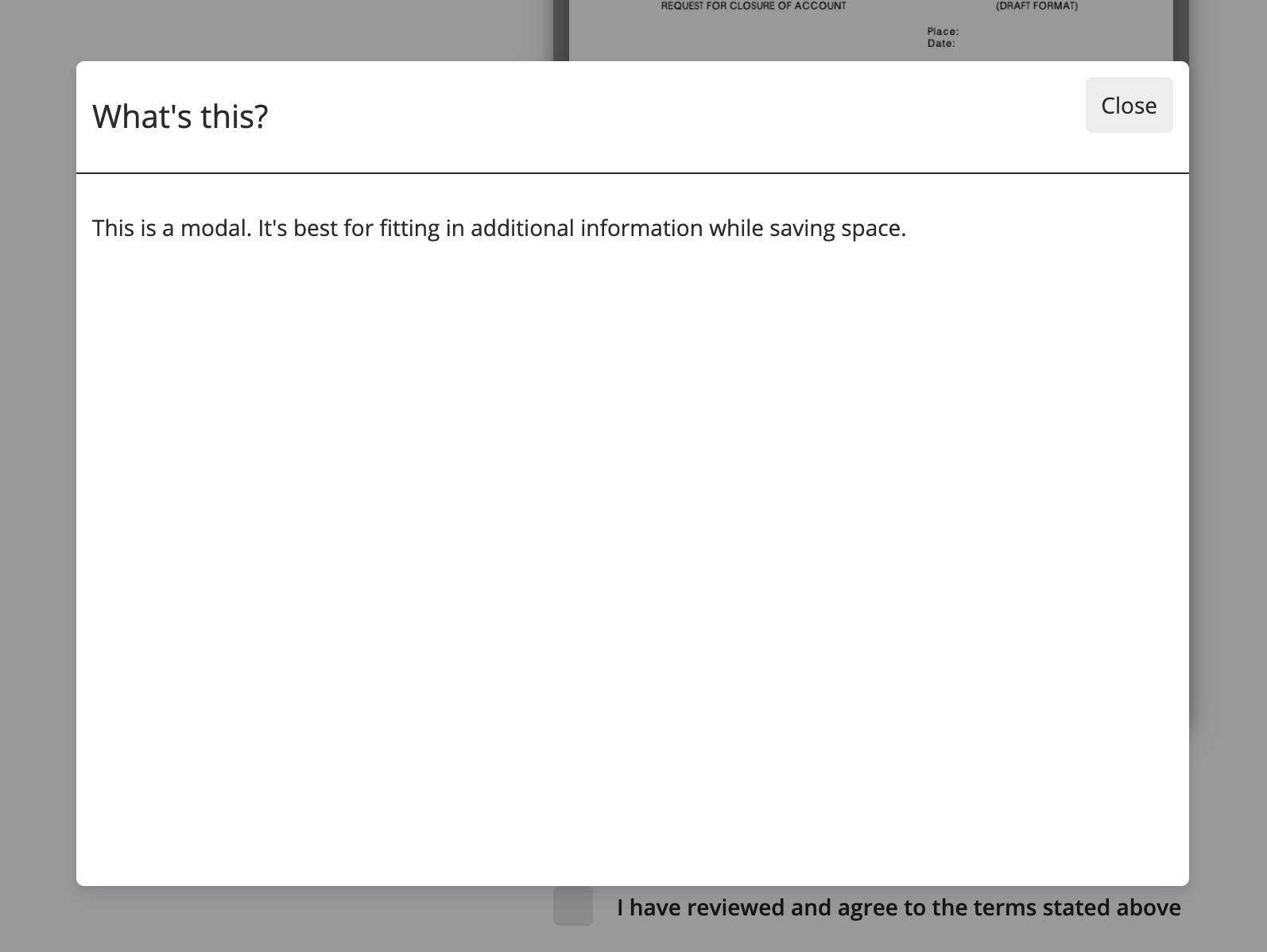
Modals show additional information in a pop up to save space
Configuration | Value |
|---|---|
Modal Header | Enter a header for your modal pop up |
Modal Body | Enter body text for your modal pop up |
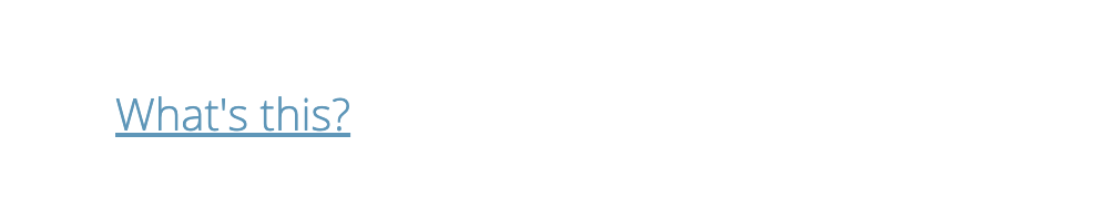
Label | Enter a label for your modal input |
CSS Color | Enter a hex code to change the color of your label |
Theme-able Classes
.themeable_input_generic_container {
  // styling of the generic input container
}

.themeable_input_modal_container {
  // styling of the input modal specific element containing the label and icon
}

.themeable_input_modal_label {
  // styling of the modal input text when closed
}

.themeable_input_modal_info_icon {
  // styling of the info icon when closed
}

.themeable_input_modal_background {
  // styling of the background when modal is opened (currently the darkish opaque effect)
}

.themeable_input_modal_container {

}

.themeable_input_modal {
  // styling of the root element containing the header and body when opened
}

.themeable_input_modal_header {
  // styling of the header of modal when opened
}

.themeable_input_modal_body {
  // styling of the body of the modal when opened
}
Updated 4 months ago